Tafe NSW Rebrand
The Brief: To reinvigorate the TAFE NSW brand as they underwent significant change in amalgamating 10 institutes into One TAFE. The new brand needed to be progressive, exciting and relevant – positioning TAFE as a leading educator.
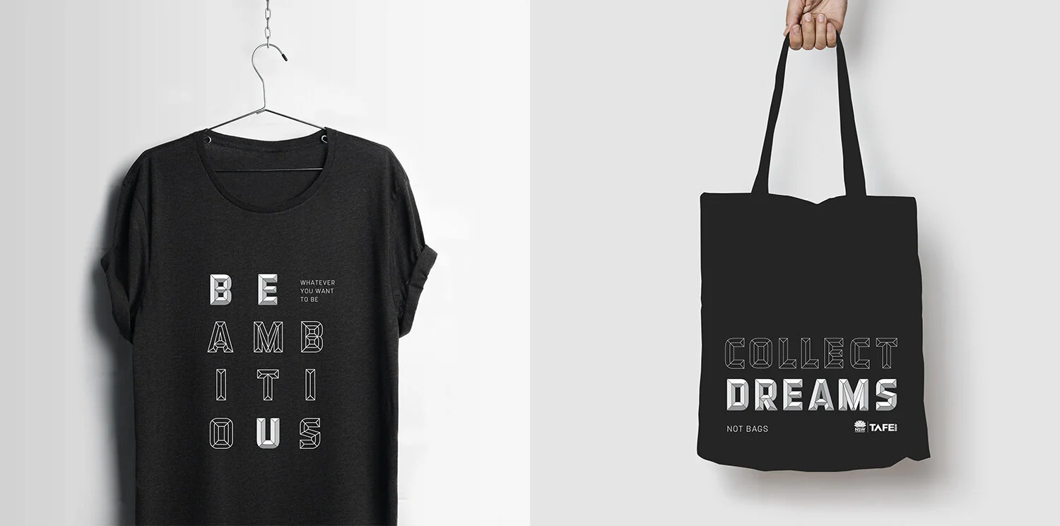
The Solution: A highly flexible visual identity that uses a vibrant and broad colour palette to reflect the diversity and energy of the audience. A bespoke typeface drives the identity and is representative of the creation and fulfilment of ambitions.
Project completed during my time at uberbrand.


TAFE Enterprise
The brand needed to be flexible enough to adapt for a B2B audience.
The TAFE Enterprise sub brand uses a more refined colour palette, studio style photography and keyline versions of the graphic devices.

